Paisaipaisa
Paisaipaisa
Paisaipaisa
Paisaipaisa
Paisaipaisa
Scope of work
Web-app Design, Research & Testing
Web-app Design, Research & Testing
Web-app Design, Research & Testing

Project overview
Redefining the interest rates comparison experience
Redefining the interest rates comparison experience
Redefining the interest rates comparison experience
Redefining the interest rates comparison experience
Project overview
As a freelancing UI/UX designer, I simplified complex financial data into an intuitive, user-friendly experience. Focusing on easy comparisons of interest rates, loans, and investments, I blended functionality with aesthetics to empower users. This project was a rewarding journey of understanding user needs and improving financial decision-making in Nepal.
Paisaipaisa helps users easily compare interest rates and financial products across banks in Nepal. From fixed deposits and savings accounts to loans and investments, the platform provides up-to-date information to help you make informed decisions, ensuring you get the best value for your money and reach your financial goals.
Role
UI/UX Desinger
UI/UX Desinger
UI/UX Desinger
UI/UX Desinger
Timeline & Year
4 mos, Sep - Dec 2024
4 mos, Sep - Dec 2024
4 mos, Sep - Dec 2024
4 mos, Sep - Dec 2024
Team members
1 Senior Designer,
1 Creator/Designer,
2 Developers,
1 Senior Designer,
1 Creator/Designer,
2 Developers,
1 Senior Designer,
1 Creator/Designer,
2 Developers,
1 Senior Designer,
1 Creator/Designer,
2 Developers,
Tools used
Figma
Figma
Figma
Figma
Challenges:
Challenges:
Challenges:
How might we help customers be confident about using Paisaipaisa to compare the rates?
Users feel confused and hesitant while using the tool to compare rates.
How might we lead the users to the detailed page of the interest rate?
Users are unaware that detailed comparison page exists.
How might we help customers be confident about using Paisaipaisa to compare the rates?
Users feel confused and hesitant while using the tool to compare rates.
How might we lead the users to the detailed page of the interest rate?
Users are unaware that detailed comparison page exists.
How might we help customers be confident about using Paisaipaisa to compare the rates?
Users feel confused and hesitant while using the tool to compare rates.
How might we lead the users to the detailed page of the interest rate?
Users are unaware that detailed comparison page exists.
How might we help customers be confident about using Paisaipaisa to compare the rates?
Users feel confused and hesitant while using the tool to compare rates.
How might we lead the users to the detailed page of the interest rate?
Users are unaware that detailed comparison page exists.
Solution(s):
Solution(s):
Solution(s):
Adding educational content including blogs and tips.
Prominent CTAs for clearer flow and interactions.
Minimalist design for a view with better clarity.
Adding educational content including blogs and tips.
Prominent CTAs for clearer flow and interactions.
Minimalist design for a view with better clarity.
Adding educational content including blogs and tips.
Prominent CTAs for clearer flow and interactions.
Minimalist design for a view with better clarity.
Adding educational content including blogs and tips.
Prominent CTAs for clearer flow and interactions.
Minimalist design for a view with better clarity.
Phase 1: Analysis and Research
Wrongs and rights of the existing website 🕵🏻♀️
Wrongs and rights of the existing website 🕵🏻♀️
Wrongs and rights of the existing website 🕵🏻♀️
Wrongs and rights of the existing website 🕵🏻♀️
Wrongs and rights of the existing website 🕵🏻♀️
I started my journey by discovering
'What', 'why' and 'how' of the product
'What', 'why' and 'how' of the product
'What', 'why' and 'how' of the product
'What', 'why' and 'how' of the product
'What', 'why' and 'how' of the product
Project overview
My client, the senior product designer at SMTM, outlined a series of changes to be made to the existing website. The main expectation was to simplify the tool, making it more inviting for both new and old users. Since the Fintech industry was new to me, I conducted extensive research and analysis of similar platforms. This helped me gauge into the pain points and problems that could be potentially improved.
My client, the senior product designer at SMTM, outlined a series of changes to be made to the existing website. The main expectation was to simplify the tool, making it more inviting for both new and old users. Since the Fintech industry was new to me, I conducted extensive research and analysis of similar platforms. This helped me gauge into the pain points and problems that could be potentially improved.
My client, the senior product designer at SMTM, outlined a series of changes to be made to the existing website. The main expectation was to simplify the tool, making it more inviting for both new and old users. Since the Fintech industry was new to me, I conducted extensive research and analysis of similar platforms. This helped me gauge into the pain points and problems that could be potentially improved.
My client, the senior product designer at SMTM, outlined a series of changes to be made to the existing website. The main expectation was to simplify the tool, making it more inviting for both new and old users. Since the Fintech industry was new to me, I conducted extensive research and analysis of similar platforms. This helped me gauge into the pain points and problems that could be potentially improved.
Support users confidently formulate queries?
Support users confidently formulate queries?
Support users confidently formulate queries?
Support users confidently formulate queries?
Add blogs to make the tool more educating?
Add blogs to make the tool more educating?
Add blogs to make the tool more educating?
Add blogs to make the tool more educating?
Make finding information more efficient?
Make finding information more efficient?
Make finding information more efficient?
Make finding information more efficient?
Organize and display information usefully?
Organize and display information usefully?
Organize and display information usefully?
Organize and display information usefully?
Heuristic Evalution
I conducted a heuristic UX audit to evaluate the existing design. This helped in identifying what elements to retain and what needed to be improved to enhance usability and user experience. I've attached the samples of the UX Audit I performed.
I conducted a heuristic UX audit to evaluate the existing design. This helped in identifying what elements to retain and what needed to be improved to enhance usability and user experience. I've attached the samples of the UX Audit I performed.
I conducted a heuristic UX audit to evaluate the existing design. This helped in identifying what elements to retain and what needed to be improved to enhance usability and user experience. I've attached the samples of the UX Audit I performed.
I conducted a heuristic UX audit to evaluate the existing design. This helped in identifying what elements to retain and what needed to be improved to enhance usability and user experience. I've attached the samples of the UX Audit I performed.

Next,
I explored, explored & explored.
I explored, explored & explored.
I explored, explored & explored.
I explored, explored & explored.
I explored, explored & explored.
Project overview
Next, I explored similar financial tools online, testing their usability and understanding their approaches. This research gave me valuable insights into industry standards and user expectations, shaping the direction of my design. My top picks were:
Next, I explored similar financial tools online, testing their usability and understanding their approaches. This research gave me valuable insights into industry standards and user expectations, shaping the direction of my design. My top picks were:
Next, I explored similar financial tools online, testing their usability and understanding their approaches. This research gave me valuable insights into industry standards and user expectations, shaping the direction of my design. My top picks were:
Next, I explored similar financial tools online, testing their usability and understanding their approaches. This research gave me valuable insights into industry standards and user expectations, shaping the direction of my design. My top picks were:
Bankrate
Bankrate
Bankrate
Bankrate
Nerd wallet
Nerd wallet
Nerd wallet
Nerd wallet
Groww India
Groww India
Groww India
Groww India
Bankbyaj
Bankbyaj
Bankbyaj
Bankbyaj
Phase 2: Design Solutions
Reinventing Paisaipaisa's Identity 🐣
Reinventing Paisaipaisa's Identity 🐣
Reinventing Paisaipaisa's Identity 🐣
Reinventing Paisaipaisa's Identity 🐣
Reinventing Paisaipaisa's Identity 🐣
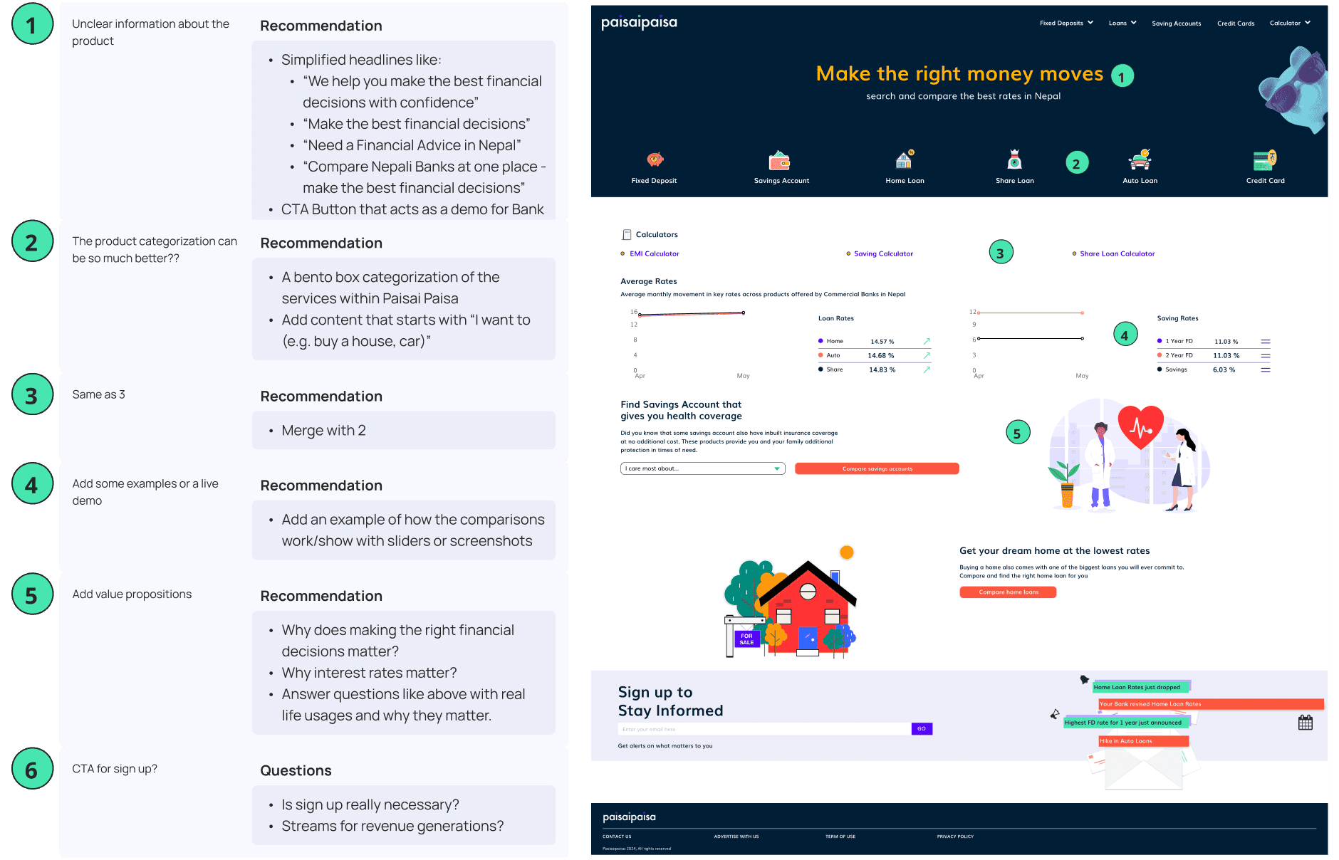
Problem: Users have a difficulty in understanding what Paisaipaisa does.
So, I laid out the design Foundation with Homepage
So, I laid out the design Foundation with Homepage
So, I laid out the design Foundation with Homepage
So, I laid out the design Foundation with Homepage
So, I laid out the design Foundation with Homepage
From the start, I focused on simplifying the experience for users while ensuring the platform delivered clear, actionable information. The fixes lay in creating a design that felt intuitive and approachable, break down information into manageable sections to avoid overwhelming users.
Organize complex financial data into digestible sections.
Maximize screen space with expandable and collapsible sections.
Add 'shortcut' buttons for quick interactions
Give users control over their navigation and exploration.
Before
Before
Before
Before

After
After
After
After

->
Clear info about what the product does
Clear info about what the product does
Clear info about what the product does
Clear info about what the product does
->
Quick buttons into the product main features
Quick buttons into the product main features
Quick buttons into the product main features
Quick buttons into the product main features
->
Overview of the top rates - centric for the old users
Overview of the top rates - centric for the old users
Overview of the top rates - centric for the old users
Overview of the top rates - centric for the old users
->
Conceptual layout of the blogs
Conceptual layout of the blogs
Conceptual layout of the blogs
Conceptual layout of the blogs
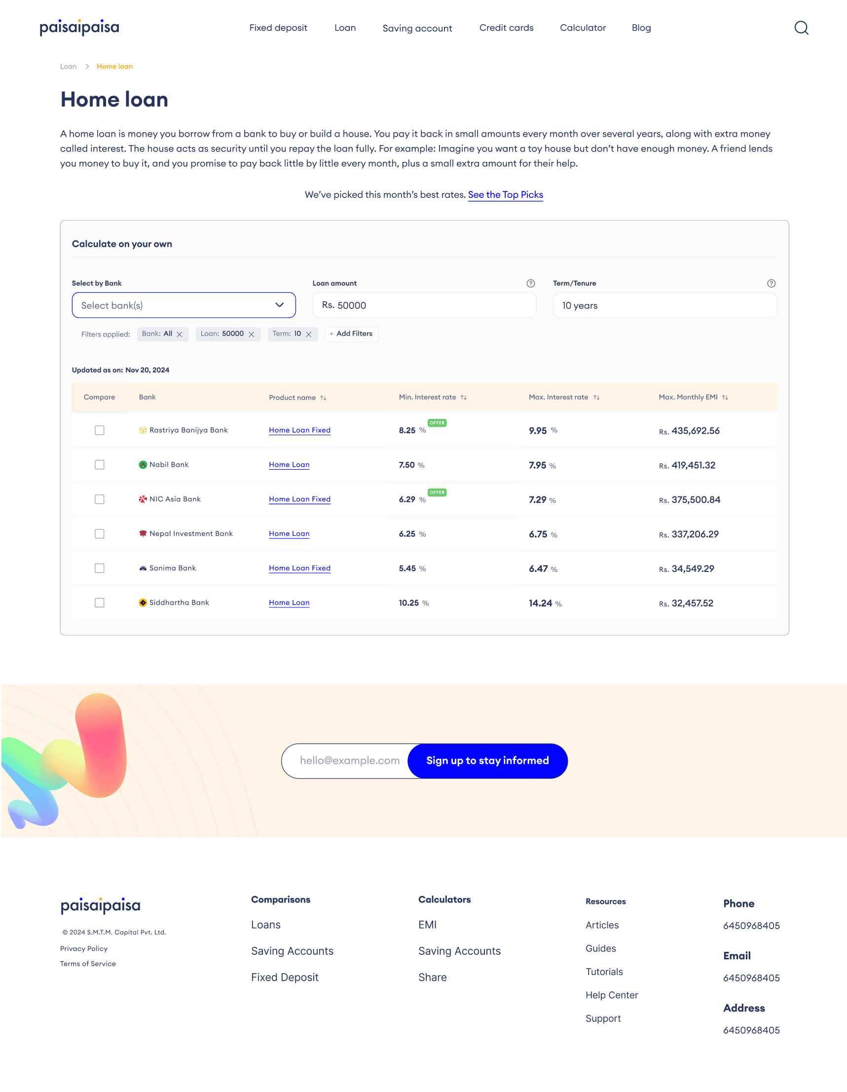
Problem: Users have a low confidence about what kind of product they are comparing.
I built the main product features: Comparable rates
I built the main product features: Comparable rates
I built the main product features: Comparable rates
I built the main product features: Comparable rates
I built the main product features: Comparable rates
This section needed to enable users to input their preferences and generate tailored interest rates effortlessly. The goal was to create a seamless and intuitive experience that empowered users to make informed financial decisions with ease.
This section needed to enable users to input their preferences and generate tailored interest rates effortlessly. The goal was to create a seamless and intuitive experience that empowered users to make informed financial decisions with ease.
This section needed to enable users to input their preferences and generate tailored interest rates effortlessly. The goal was to create a seamless and intuitive experience that empowered users to make informed financial decisions with ease.
This section needed to enable users to input their preferences and generate tailored interest rates effortlessly. The goal was to create a seamless and intuitive experience that empowered users to make informed financial decisions with ease.
Before
Before
Before
Before
After
After
After
After

->
Collapsable educating content; for new users
Collapsable educating content; for new users
Collapsable educating content; for new users
Collapsable educating content; for new users
->
Clear segregation of the filters
Clear segregation of the filters
Clear segregation of the filters
Clear segregation of the filters
->
Data table
Data table
Data table
Data table
->
'Updated as on' gives a better overview of the data
'Updated as on' gives a better overview of the data
'Updated as on' gives a better overview of the data
'Updated as on' gives a better overview of the data
->
Top Picks; for old users
Top Picks; for old users
Top Picks; for old users
Top Picks; for old users
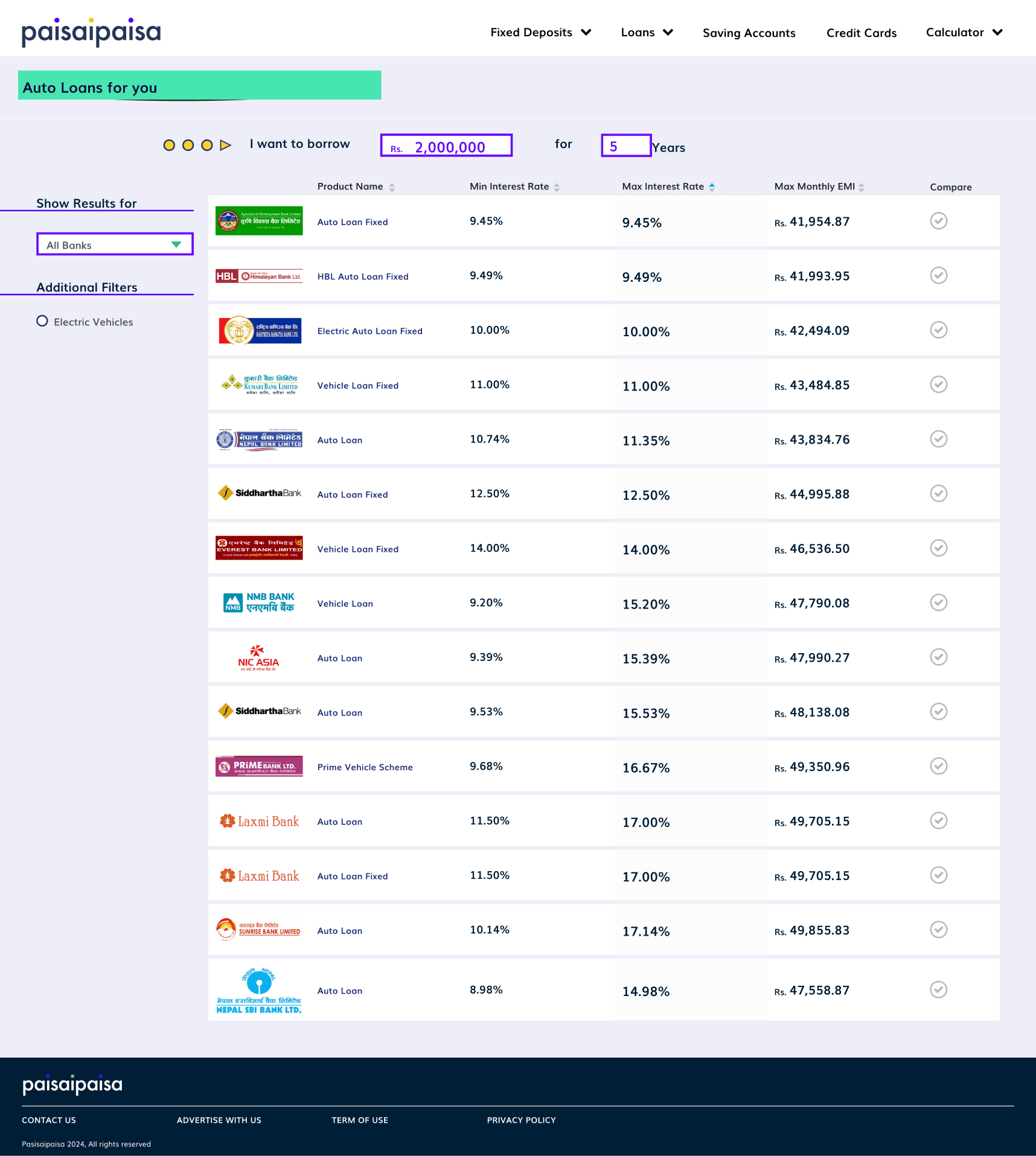
Problem: Comparisons can be comfusing!
Simple tables for complex information!
Simple tables for complex information!
Simple tables for complex information!
Simple tables for complex information!
Simple tables for complex information!
Made the comparison table a simple one
Made the comparison table a simple one
Made the comparison table a simple one
Made the comparison table a simple one
Before
Before
Before
Before

After
After
After
After

->
Opted for horizontally dividing alternative colors
Opted for horizontally dividing alternative colors
Opted for horizontally dividing alternative colors
Opted for horizontally dividing alternative colors
Problem: Users have a strain when using this page, the colors are out of place.
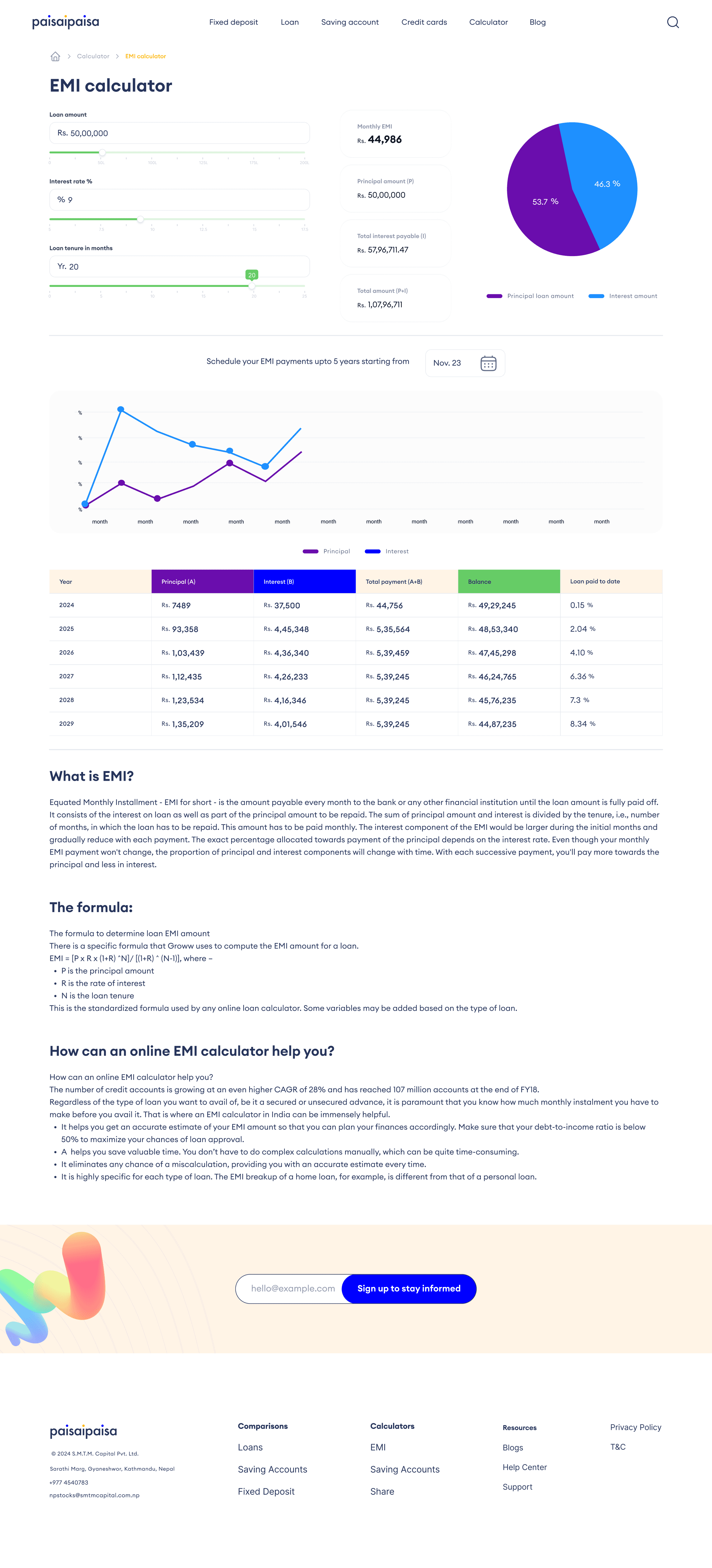
Solid and more information on the Infographics
Solid and more information on the Infographics
Solid and more information on the Infographics
Solid and more information on the Infographics
Solid and more information on the Infographics
Integrated educational content alongside the calculator to guide users through the process.
Simplified the interface to minimize confusion and enhance usability.
Added visually appealing infographics to present complex data in an engaging and digestible format.
Integrated educational content alongside the calculator to guide users through the process.
Simplified the interface to minimize confusion and enhance usability.
Added visually appealing infographics to present complex data in an engaging and digestible format.
Integrated educational content alongside the calculator to guide users through the process.
Simplified the interface to minimize confusion and enhance usability.
Added visually appealing infographics to present complex data in an engaging and digestible format.
Integrated educational content alongside the calculator to guide users through the process.
Simplified the interface to minimize confusion and enhance usability.
Added visually appealing infographics to present complex data in an engaging and digestible format.
Before
Before
Before
Before

After
After
After
After
->
Breadcrumbs for better navigation
Breadcrumbs for better navigation
Breadcrumbs for better navigation
Breadcrumbs for better navigation
->
A concept of monthly EMI to be paid in line graphs
A concept of monthly EMI to be paid in line graphs
A concept of monthly EMI to be paid in line graphs
A concept of monthly EMI to be paid in line graphs
->
Data table
Data table
Data table
Data table
->
Educating content; specially for the new comers using the tool
Educating content; specially for the new comers using the tool
Educating content; specially for the new comers using the tool
Educating content; specially for the new comers using the tool
->
Uniform design along with better infographic
Uniform design along with better infographic
Uniform design along with better infographic
Uniform design along with better infographic
Problem: The client envisions that this tool can come in handy for a lifetime for any user, specially the young ones. But, the youth gets easily intimidated by the tool.
Problem: The client envisions that this tool can come in handy for a lifetime for any user, specially the young ones. But, the youth gets easily intimidated by the tool.
Problem: The client envisions that this tool can come in handy for a lifetime for any user, specially the young ones. But, the youth gets easily intimidated by the tool.
Problem: The client envisions that this tool can come in handy for a lifetime for any user, specially the young ones. But, the youth gets easily intimidated by the tool.
Education, Education, Education
Education, Education, Education
Education, Education, Education
Education, Education, Education
Education, Education, Education
Integrated blogs as a concept - not massively niched ones but helpful content for starters.
Exposing the youth to the panel of different types of products
Integrated blogs as a concept - not massively niched ones but helpful content for starters.
Exposing the youth to the panel of different types of products
Integrated blogs as a concept - not massively niched ones but helpful content for starters.
Exposing the youth to the panel of different types of products
Integrated blogs as a concept - not massively niched ones but helpful content for starters.
Exposing the youth to the panel of different types of products
Blogs page
Blogs page
Blogs page
Blogs page

Overall products
Overall products
Overall products
Overall products

Phase 3: Deliver
Testing & Final Design 👩🏻🎨
Testing & Final Design 👩🏻🎨
Testing & Final Design 👩🏻🎨
Testing & Final Design 👩🏻🎨
Testing & Final Design 👩🏻🎨
Problem: The early iteration of the comparison page was not simple enough. The users miss filters and product page.
Less is more and boundaries are important!
Less is more and boundaries are important!
Less is more and boundaries are important!
Less is more and boundaries are important!
Less is more and boundaries are important!
I focused on adding boundaries and making everything on the Comparison Page more simple. These are the areas I made changes into:
Collapsable feature on the content section was unnecessary.
The three tones on a single line of 'Top Picks' was too distracting.
Filters can be easily missed so I added a section around it
The filters/calculations section was quite complex to understand.
The filters/calculations section and the table looked like two separate things.
'Updated as on: date' is an important information, specially for the old users, and I wanted it to appear at the top. This information gives more confidence to the users about the data they are receiving.
Early iteration
Early iteration
Early iteration
Early iteration
Final
Final
Final
Final
->
Ditched the collapsable section for a simple one
Ditched the collapsable section for a simple one
Ditched the collapsable section for a simple one
Ditched the collapsable section for a simple one
->
Quick button is now less distracting
Quick button is now less distracting
Quick button is now less distracting
Quick button is now less distracting
->
Changing color and adding an underline to 'Product name' to make it look like a link
Changing color and adding an underline to 'Product name' to make it look like a link
Changing color and adding an underline to 'Product name' to make it look like a link
Changing color and adding an underline to 'Product name' to make it look like a link
->
'Calculate on your own' helps to understand the tool
'Calculate on your own' helps to understand the tool
'Calculate on your own' helps to understand the tool
'Calculate on your own' helps to understand the tool
->
Better clarity about the filters
Better clarity about the filters
Better clarity about the filters
Better clarity about the filters
->
Prioritise 'Compare' feature by putting it at the beginning
Prioritise 'Compare' feature by putting it at the beginning
Prioritise 'Compare' feature by putting it at the beginning
Prioritise 'Compare' feature by putting it at the beginning
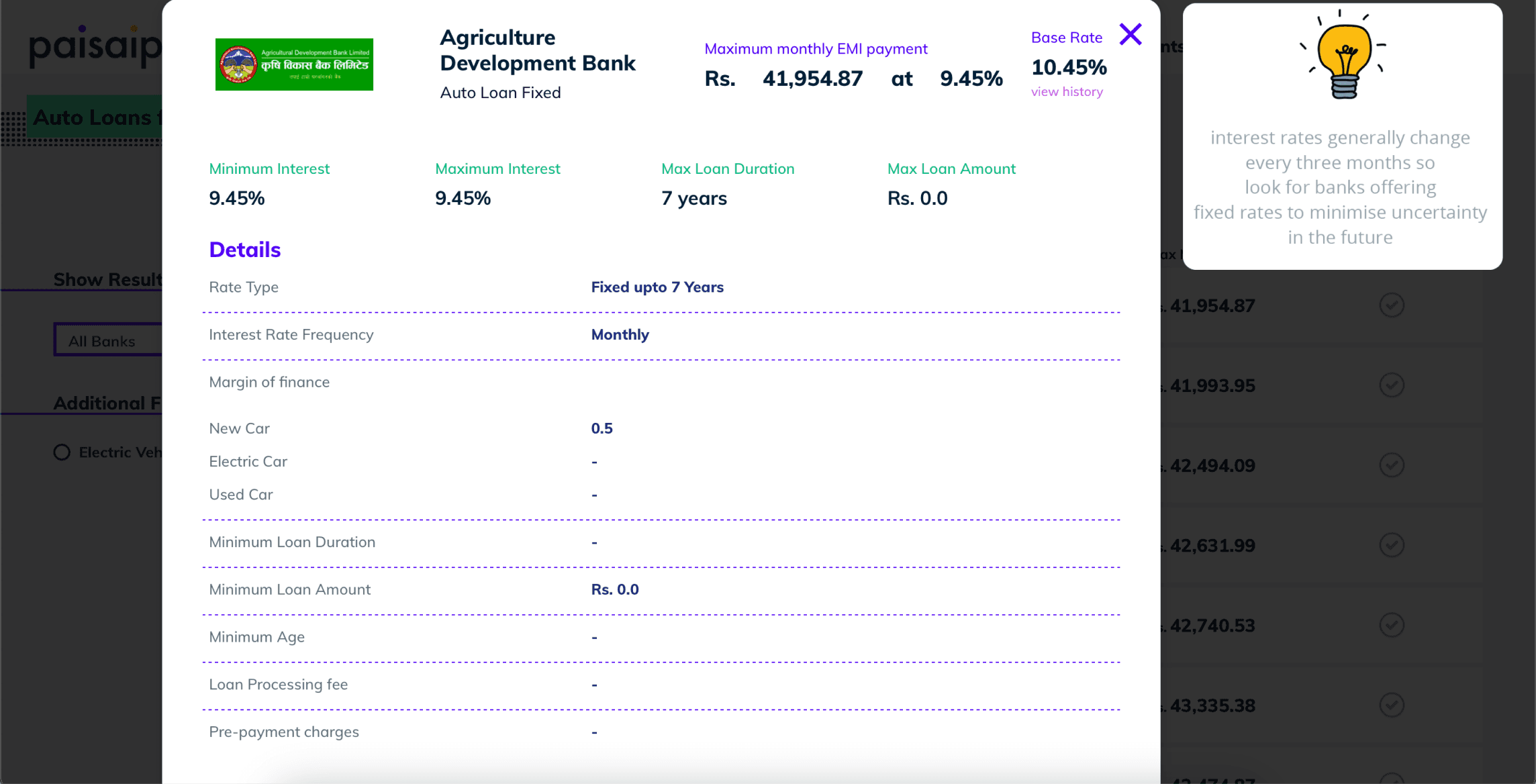
Problem: Users rarely open the main product page. They miss that opening the 'Product name' leads to the respective product page.
Make a link look like a link!
Make a link look like a link!
Make a link look like a link!
Make a link look like a link!
Make a link look like a link!
I ensured to make a link button look like a button so that the users wouldn't miss opening it. The final comparison page, above this section, leads to the product page. Product page is the one of the most integral and important part of the this entire system. But, it is so mislead that even I forgot that it exists!
I ensured to make a link button look like a button so that the users wouldn't miss opening it. The final comparison page, above this section, leads to the product page. Product page is the one of the most integral and important part of the this entire system. But, it is so mislead that even I forgot that it exists!
I ensured to make a link button look like a button so that the users wouldn't miss opening it. The final comparison page, above this section, leads to the product page. Product page is the one of the most integral and important part of the this entire system. But, it is so mislead that even I forgot that it exists!
I ensured to make a link button look like a button so that the users wouldn't miss opening it. The final comparison page, above this section, leads to the product page. Product page is the one of the most integral and important part of the this entire system. But, it is so mislead that even I forgot that it exists!
Before
Before
Before
Before
After
After
After
After
->
Clear separation of the product details
Clear separation of the product details
Clear separation of the product details
Clear separation of the product details
->
Balancing the view by addressing the 'Tips' at the end
Balancing the view by addressing the 'Tips' at the end
Balancing the view by addressing the 'Tips' at the end
Balancing the view by addressing the 'Tips' at the end
Lastly,
Hand-off after testing
Hand-off after testing
Hand-off after testing
Hand-off after testing
I tested the final with 2 internal recruiters and 3 external ones. After having a decent feedback on the flow, I handed-off the final designs. At the final stage, I only made changes to the main comparison computation page and product page.
I tested the final with 2 internal recruiters and 3 external ones. After having a decent feedback on the flow, I handed-off the final designs. At the final stage, I only made changes to the main comparison computation page and product page.
I tested the final with 2 internal recruiters and 3 external ones. After having a decent feedback on the flow, I handed-off the final designs. At the final stage, I only made changes to the main comparison computation page and product page.
Reflecting..
Reflecting..
Reflecting..
Reflecting..
Reflecting..
I'd like to give a
Shout out to the amazing people I came across in this project
Shout out to the amazing people I came across in this project
Shout out to the amazing people I came across in this project

Toran
Toran
Toran
Toran
Product Designer
Product Designer
Product Designer

Suprina
Suprina
Suprina
Suprina
Creator/Designer
Creator/Designer
Creator/ Designer
Creator/ Designer

Rajat
Rajat
Rajat
Rajat
Developer
Developer
Developer Developer
Developer Developer

Ayush
Ayush
Ayush
Ayush
Developer
Developer
Developer Developer
Developer Developer

SMTM Capital
SMTM Capital
SMTM Capital
SMTM Capital SMTM
The entire org.
The entire org.
The entire org.
It's a wrap!
Next: Reduct Benchmark
It's a wrap!
Next: Reduct Benchmark
It's a wrap!
Next: Reduct Benchmark
It's a wrap!
Next: Reduct Benchmark
It's a wrap!
Next: Reduct Benchmark
->
->
->
->
->